Microsoft Unveils New Logo for Edge Browser- No more Internet Explorer Vibes
Microsoft was failing compared to new improved browser competition from Chrome, Firefox, etc. Thus came Edge, which kind of looked like IE again (including the logo) and failed miserably as well. Now Microsoft wants to start from a clean slate and use the most famous browser as base, Chrome. But to get rid of negativity attached to Internet Explorer and Old Edge, they are now introducing a new Logo.
Design
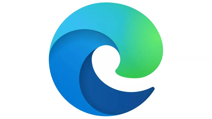
Welcome Edge! Well, it still kind of looks like big E, but this time it uses Fluent Design guideline by Microsoft and looks like a big ass wave which is nice as this will be used to “surf” the web. The design is definitely more colorful. The icon cues are certainly taken from Microsoft’s new office icons which is again based on Fluent Design language.
The beta version of Microsoft edge based on chromium was unveiled in August but the final version is still not in sight. The new logo might hint at the final version coming along and just waiting to be unveiled any moment.
The logo was unveiled with an elaborated easter egg hunt on reddit.

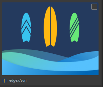
New Surf Game
Microsoft in its canary build of edge has a new surf game too. Get the instructions from this link.
- Titan Fall(ter): Intel’s Stumble an Analysis - August 5, 2024
- AMDs Radeon Future Looks Bleak After RDNA 5 - May 1, 2024
- Kinect 2- Right time to use A.I. in Nextgen Consoles? - April 30, 2024


Pingback: Microsoft's Edge Browser in Chromium Avtar Goes Stable - AbhiFX